Events are leading a new aesthetic movement toward expressive, humanist design.

In the corporate space, brand design has been dominated by purposefully utilitarian, simple aesthetics. In 2019, prominent company, after company, after company, and even US Government agency, has adopted sans serif fonts, high-contrast color pallets, and streamlined grid systems. In any Millennial’s home, Marie Kondo and décor catalogs continue to reinforce the functional and minimalist in design.
But like any good trend, minimalist design has reached a tipping point. When that happens, businesses—and people—look for what’s new and fresh. So what looks new and fresh today? An aesthetic that is more natural, more complex, and more human.
For businesses, this shifting aesthetic first started showing up within their events.
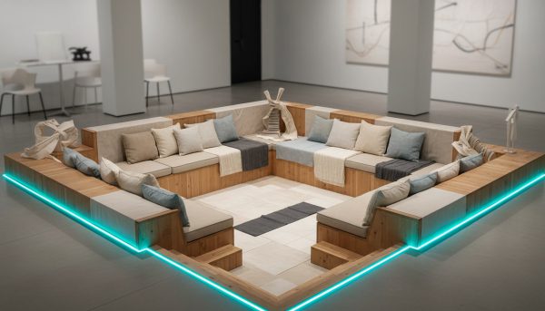
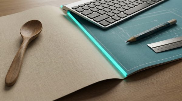
Over the past two years, event environments have trended toward hygge—the Danish concept of a “cozy” lifestyle—and retro, mid-century throwback designs. Recently, public-facing event brands have begun embracing a dimensional, durable, nuanced look.
Across Dreamforce, Google I/O, IBM Think, Apple WWDC, and many others, leading event brands now feel much more hackable, organic, and — most importantly — lived in. Now that the Instagram aesthetic is over, the lived-in look is exactly what people want.
The culture pendulum has shifted and it is all about to get a lot more lively.
